
Colours
The colour of consistency — Deutsche Bank Deep Blue
The colour of consistency
Deutsche Bank Deep Blue is the colour of our brand. Always refer to the colour as Deep Blue and not blue.
Our colour palette captures the full spectrum and nuances of blue, reflecting the horizon and boundless depth of our expertise.
Deep Blue in use
Used as the primary colour throughout all of our corporate and consumer communications, Deutsche Bank Deep Blue unifies our brand. It is applied across all points of contact in backgrounds,
illustrations and typography. All divisions are using the same Deep Blue to create global consistency.
Its meaning is clear: Deep Blue stands for trust and innovation while also creating a balance between security and the courage to seize new opportunities.
The CMYK and RGB values are optimised for the following colour spaces:
CMYK: PsoCoatedV3/FOGRA51
RGB/HEX: sRGB IEC61699-2.1

Capturing the power of blue, our primary colour palette is simple yet bold. It has been streamlined to ensure consistency and clarity across all brand communications.
Deep Blue – core brand colour
Deutsche Bank Deep Blue is our core brand colour that’s rich in meaning. It unifies our brand and appears across all touchpoints.
White
Used for backgrounds and text, white ensures clear and precise communications.
Grey
Featuring a subtle blue tint, grey adds texture and functionality to our palette.
Light blue and ice blue
Soft in tone yet with a touch of vibrancy, light blue is inspired by a blue sky and clear horizons, while ice blue adds an extra layer of lightness.
Bright blue and mid blue
With their familiar hue, bright blue and mid blue are used as a dynamic accent. Bright blue is used for text highlights on Deep Blue (e.g. for the sender identifier and the URL) and as an area colour. Mid blue is used for text highlights on white background as well as on grey and ice blue.
Dark blue
The heaviest colour in our palette, dark blue creates a solid base of stability and security while acting in harmony with the other colours.
Odysee blue – digital only
Odysee blue is only used for online applications. It is not printable because it cannot be displayed in CMYK. See details in “Digital principles” or “Advertising – print and online” for exact area of application of this colour

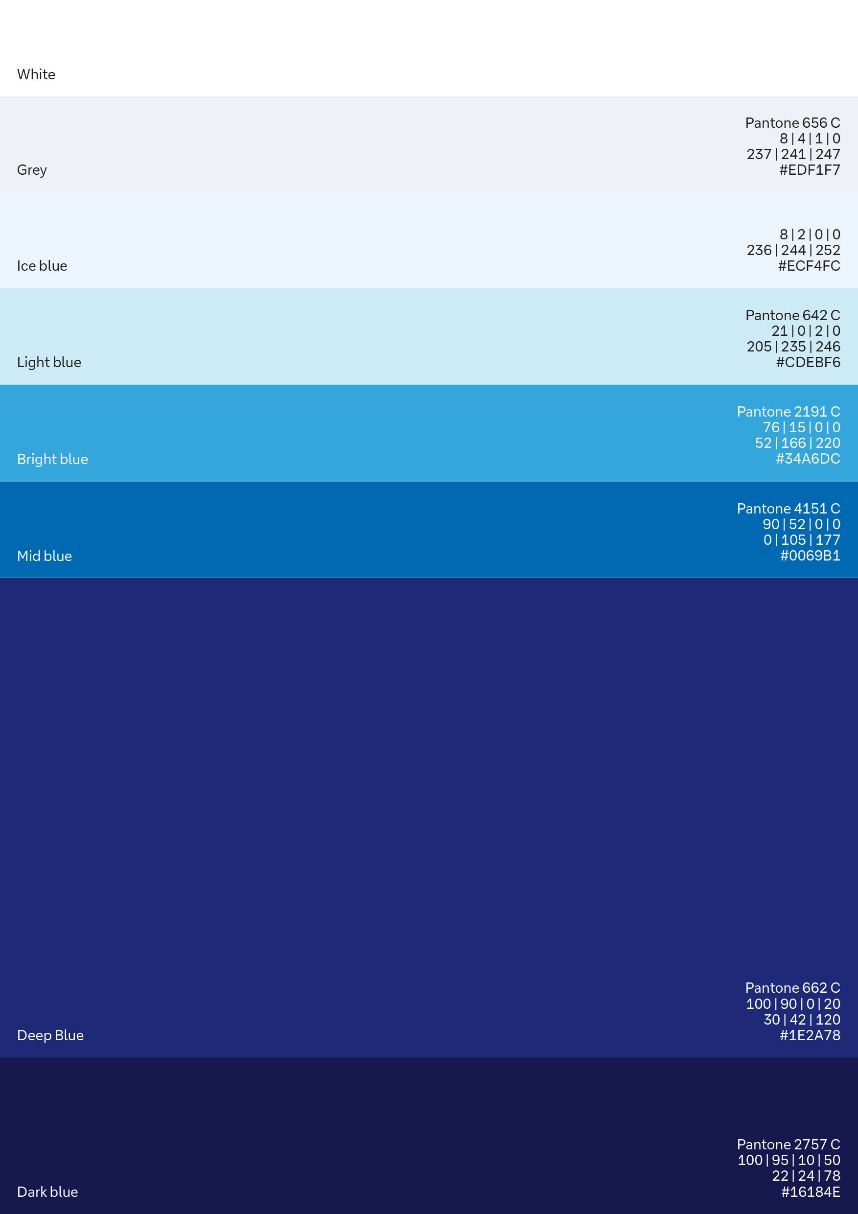
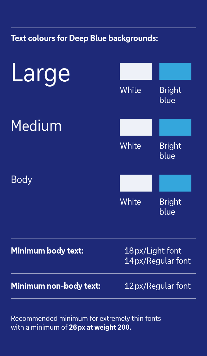
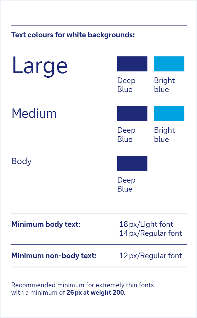
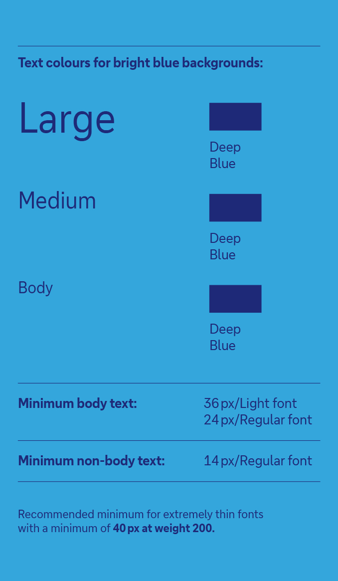
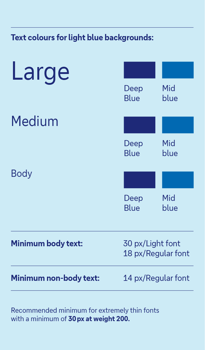
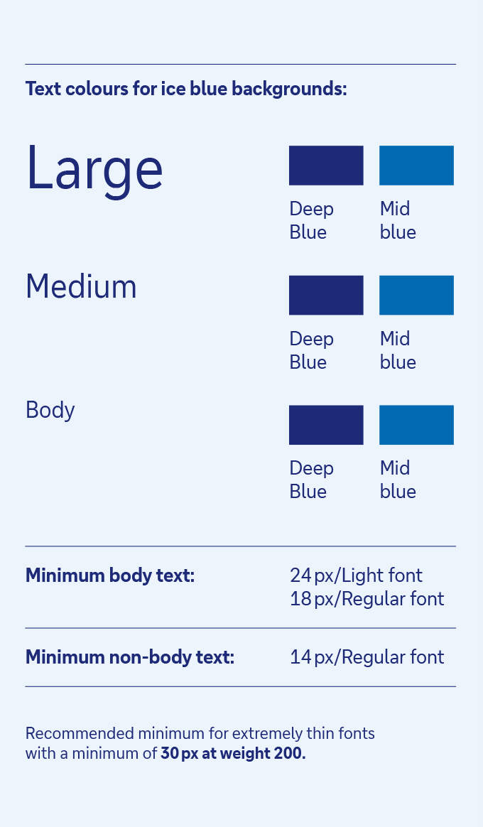
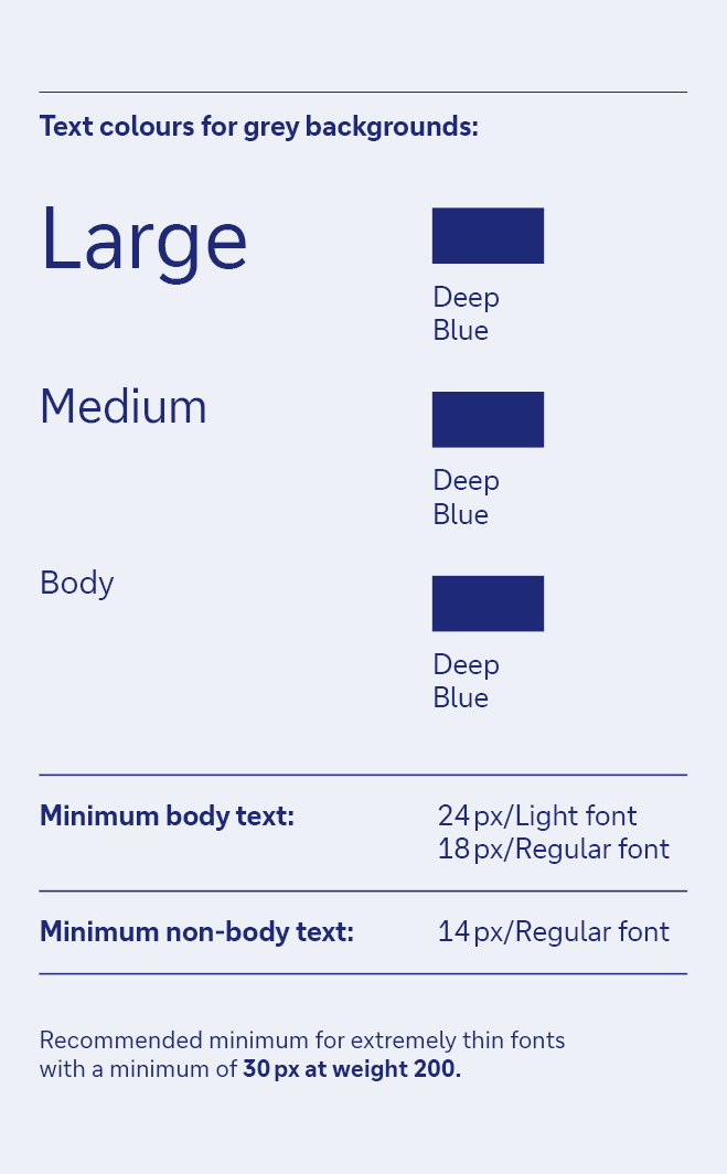
Our primary colour palette has been designed for high levels of readability and impact. Its accessibility has been tested using the APCA model (Advanced Perceptual Contrast Algorithm).
Compared to AA/AAA guidelines, APCA reviews accessibility based heavily on the colours in actual context. This results in a more readable experience for people with different types of vision.
The accessibility is calculated based on the text’s font weight, size and colour. The background image and overall context, including ambient light, surroundings and intended purpose of the text, are also taken into account.
This table shows all acceptable and unacceptable combinations for text and background.
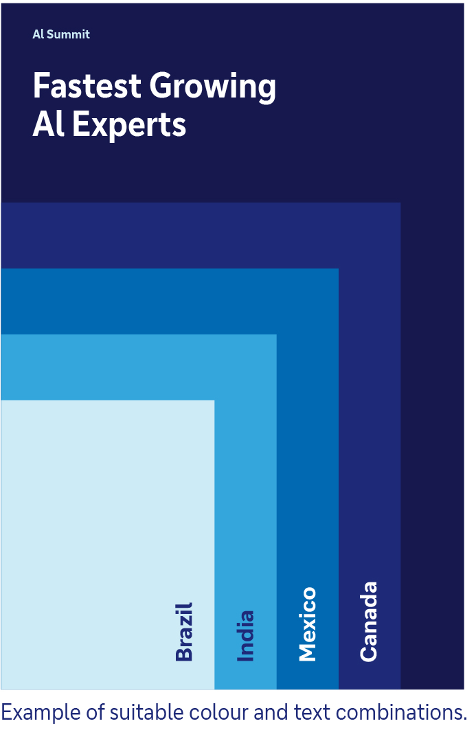
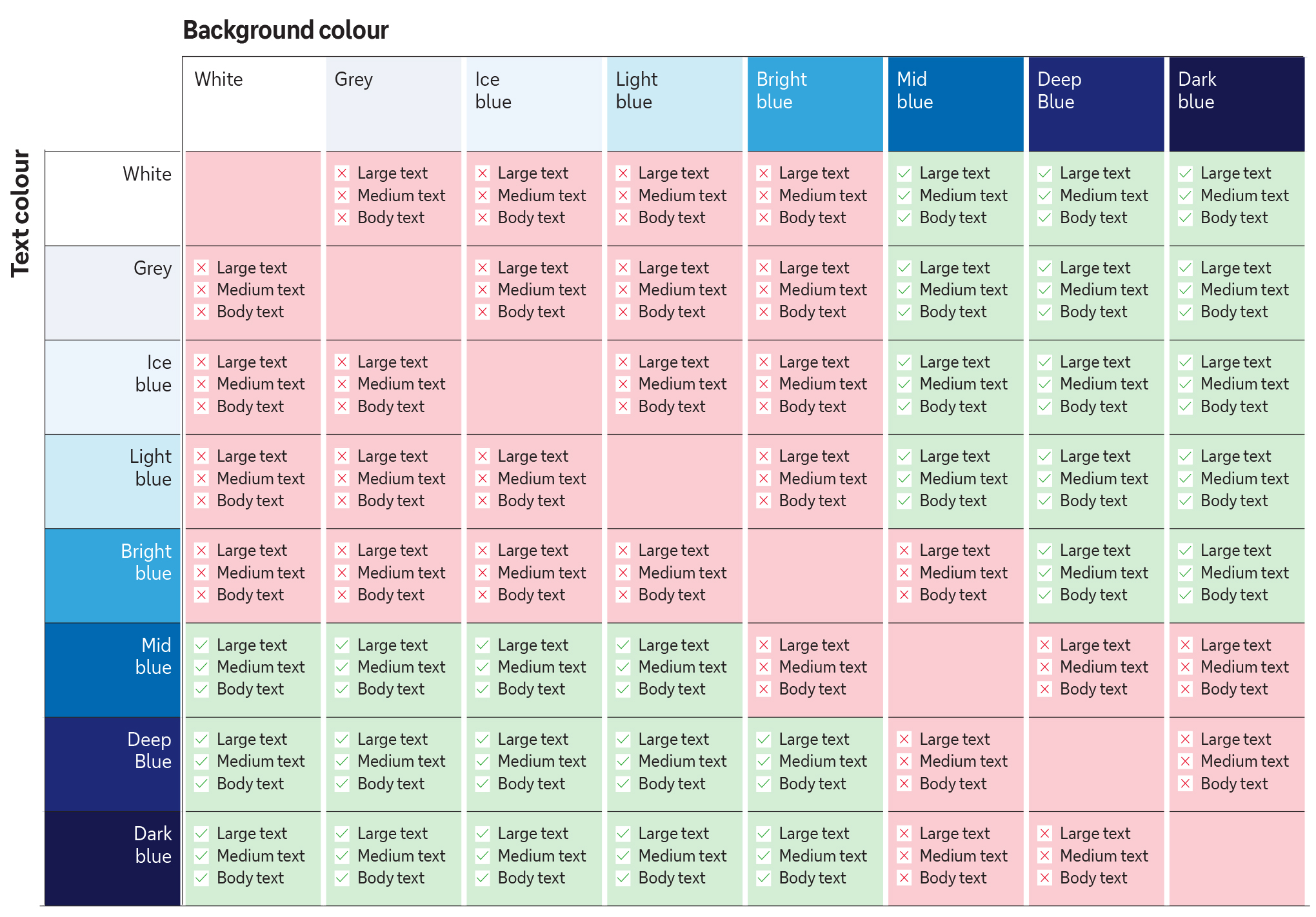
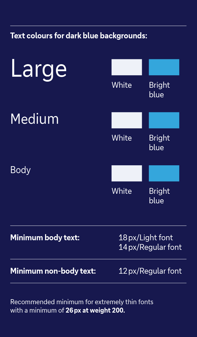
Based on the accessibility data from the previous slide, please use contrast appropriate text and background combinations as listed on this page.
Exceptional use
Important: the vibrant cyan colour can only be used for online applications. It is not printable because it cannot be displayed in CMYK.
Therefore, it should be used only as an exception for online applications when bright blue is not an option.
 |
 |
 |
 |
 |
 |
 |
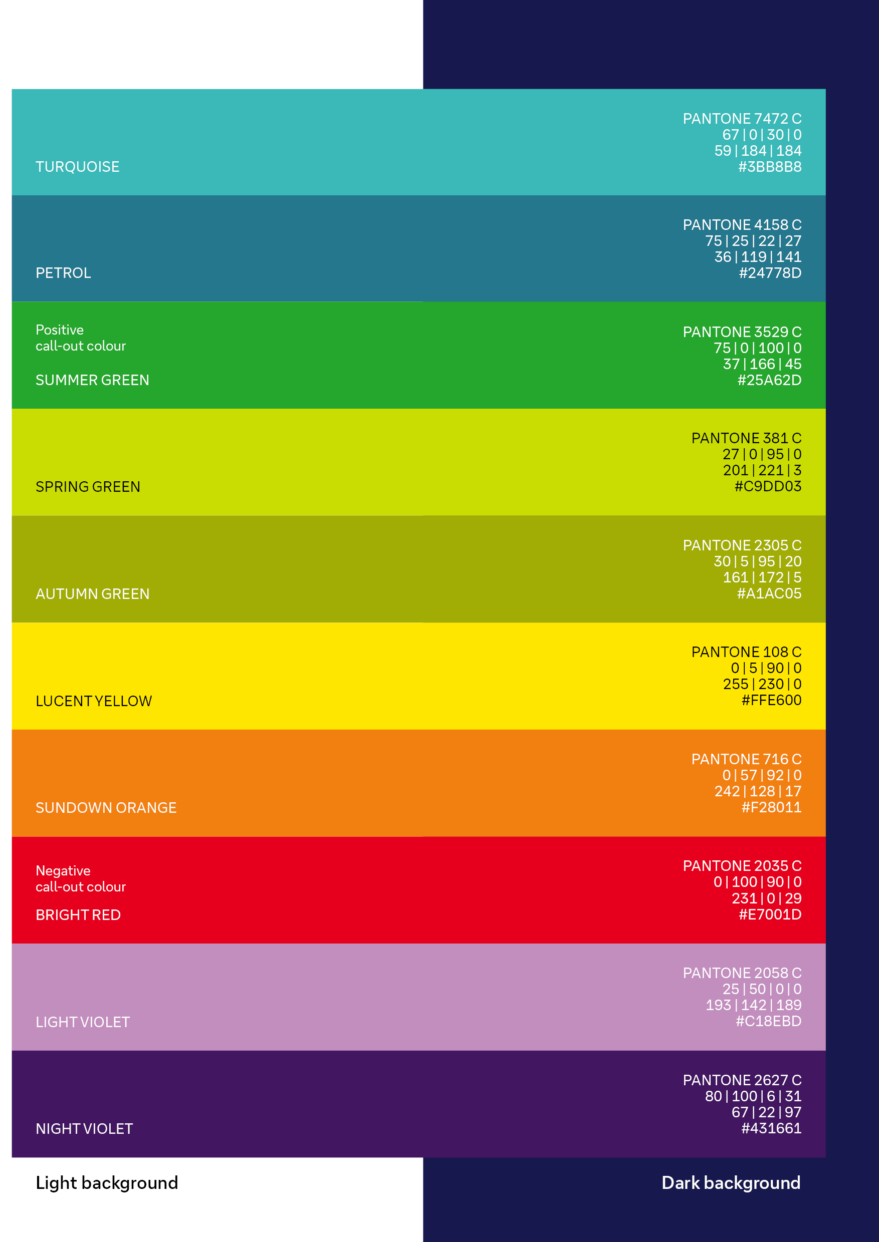
To ensure consistency, the same highlight colours are used on both light and dark backgrounds.
Accent colours are never used across the board. Icons and illustrations are designed with the blue colours of the primary palette.
Please use accent colours carefully when paired with our primary palette.
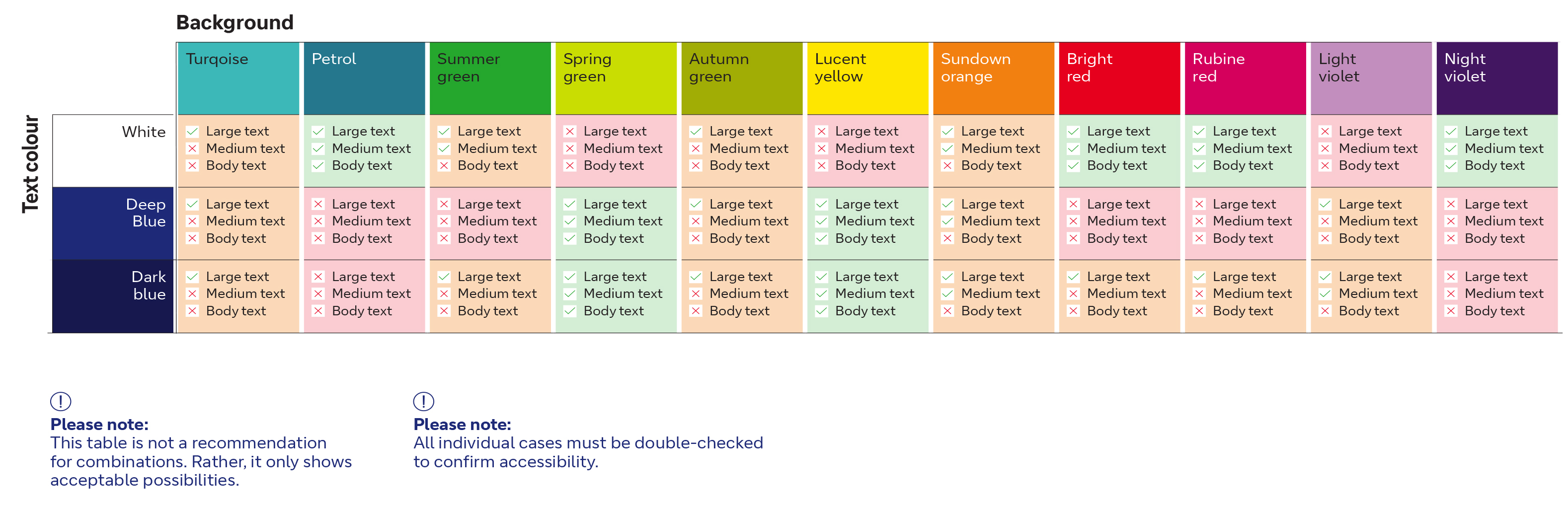
The accessibility of our accent colour palette has been tested using the APCA model (Advanced Perceptual Contrast Algorithm).
Compared to AA/AAA guidelines, APCA reviews accessibility based heavily on the colours in actual context. This results in a more readable experience for people with different types of vision.
The accessibility is calculated based on the text’s font weight, size and colour. The background image and overall context, including ambient light, surroundings and intended purpose of the text, are also taken into account.
This table shows all acceptable and unacceptable combinations for text and background.
Colour palette download
Application
Find the new colour palette as Illustrator .ase files for download and also an overview (PDF db_colour_ codes) with all colour codes described for further applications.