Stopper — usage
Simple, clear, and short
A vital design element used for communicating important information, the stopper is made to be eye-catching and easy to read. It should always be used with intention to communicate specific details, such as special conditions, a bonus offer or limited-time information.
The stopper is not a continuation of the headline or body copy. It should also not be used for generic statements, product names or further product details.

Shapes and appearances
Shapes
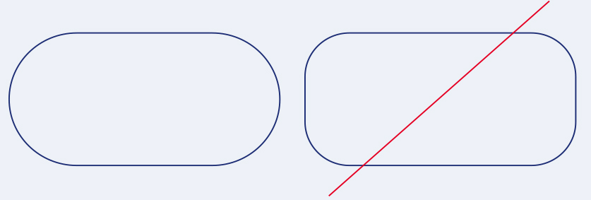
The stopper has two shapes: Dot and Dot Extended. Formed in a classic circle, Dot is the main shape to be used. Dot Extended expands horizontally to become rectangular in shape with 100 % rounded corners, and it is only to be used if a bigger amount of text is required.
Height
Due to the smaller amount of space available for the text frame, Dot must be slightly bigger than Dot Extended in order to achieve an equally disruptive effect.
Dot height:— 1 3 / 4 x
Dot Extended height:— 1 1 / 6 x
Width
The width of Dot is equal to its height, while Dot Extended has a minimum and maximum width.
Dot width:— 1 3 / 4 x
Dot Extended min. width:— 2 3 / 4 x
Dot Extended max. width:— 3 3 / 4 x
The size ratios for Dot and Dot Extended depend on the respective logo size being used on the same asset.

Measurement and typographic details
Font and font size
Text within the stopper is set in two harmonising font sizes and styles, depending on the format and application. Text highlights are placed in Deutsche Bank Bold at a larger size than the rest of the text, which is placed in Deutsche Bank Regular at a minimum of 5 pt smaller.
The spacing is set to 110 % standard and based on the smaller font size. If a descender from the first line touches an uppercase letter on the second line, the spacing must be increased to 130 %.
Make sure that the message within the stopper is short enough to fit in the defined stopper sizes. But keep in mind: to perfectly fit the text in the stopper, you can adjust the width of Dot Extended. But never exceed the minimum and maximum width sizes.
Paragraph
Stopper text is placed centred and set on a maximum of two lines. Text should be as big as possible to avoid noticeable gaps or empty spaces. Never use formal punctuation at the end of the text.
1 Borders
A descender from the second line of text must be placed within the text box and should never extend into the safe zone. The distance between the text box and the edges of the stopper is 1/6 of the logo’s height. The corners of Dot Extended must be 100 % round, meaning 1/2 of the stopper’s height.

Stopper — placement dos and don’ts
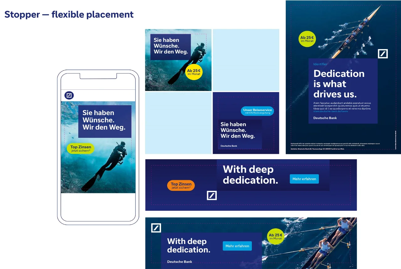
We purposefully do not specify an exact placement for the stopper. However, the following tips can help guide you in finding the perfect spot.
1 Proximity to the expanding box
The stopper must be placed close enough to the expanding box to create a clear connection between the product and the stopper’s message. With that in mind, it can be placed above and below the expanding box.
2 Safe zones
Keep in mind the safe zone area around the expanding box (1/2 x) and the logo (min. 1 x).
3 Dynamic placement
The goal is to create a dynamic layout, so avoid placing the stopper in exact alignment with the expanding box or logo. Instead, aim to place the stopper off-centre in relation to the expanding box or logo.
4 Stopper size
It is mandatory to use the stopper’s defined sizes and parameters, including the ability to adjust the width of Dot Extended. Therefore, never resize the stopper to be larger or smaller than indicated in this PDF. The size ratio is based on the 100 % Logo (S) for all required formats.

Stopper — colour combinations
Harmonious and vibrant
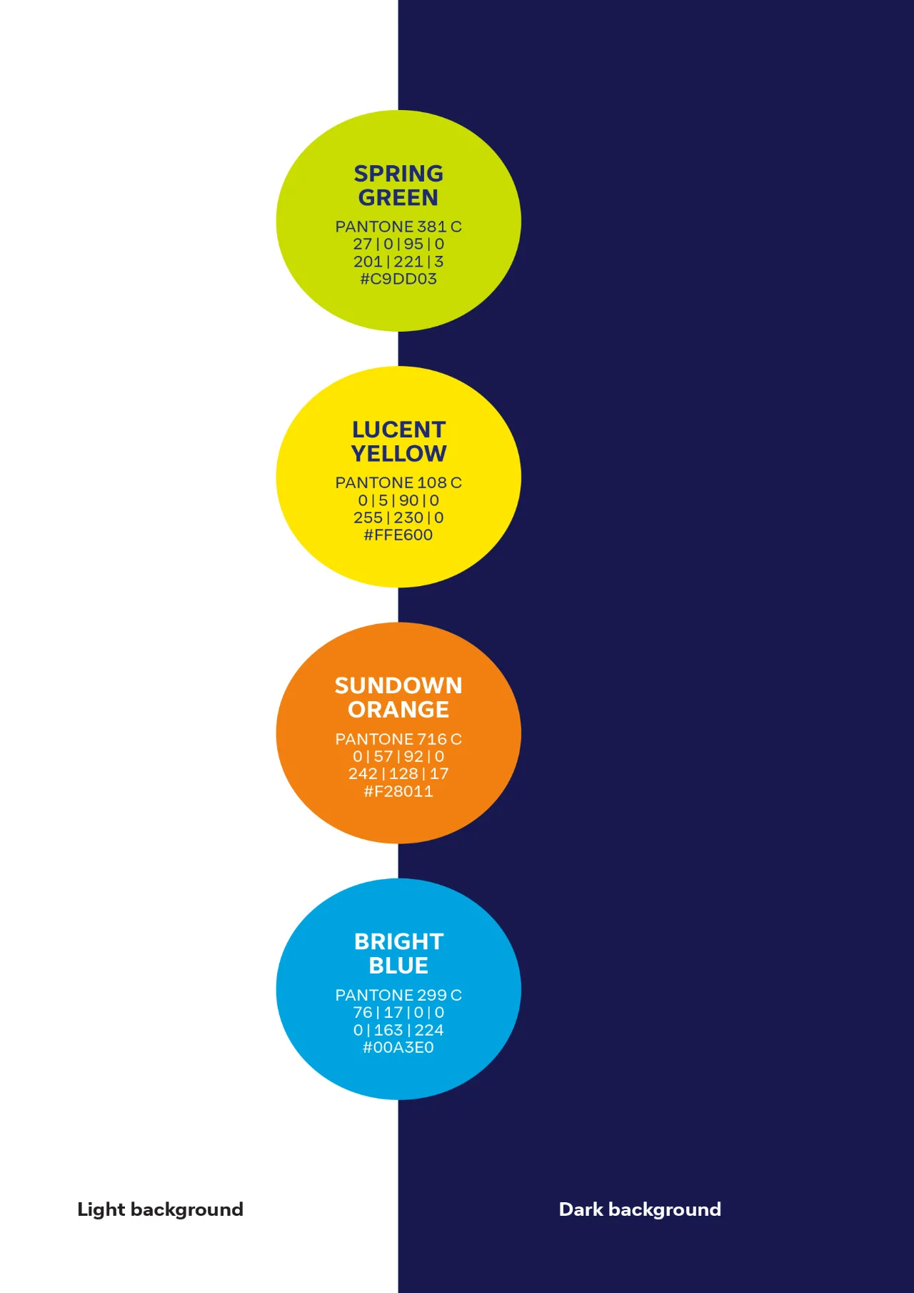
The chosen colour palette for the stopper uses our accent colours to create an instantly bright and vibrant appeal. The colours bring attention to important messages without being too aggressive and without conflicting with our blue colour world.
Bright blue
Our familiar hue, bright blue, is used when the message of the stopper is more brand or image related.
Colour combinations
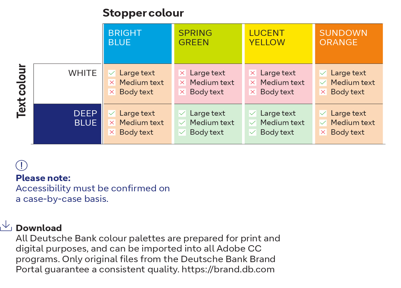
The table below shows all acceptable colour combinations, which have been verified in regard to accessibility using the APCA model (Advanced Perceptual Contrast Algorithm).
The accessibility is calculated based on the text’s font weight, size and colour. The background image and overall context, including ambient light, surroundings, and intended purpose of the text, are also taken into account.