
Typography
DeutscheBank
Our typeface is DeutscheBank. It has been created for use across all our communication assets and is based on the sans serif typeface Linear Antiqua.
How the new fonts differ from the previous fonts
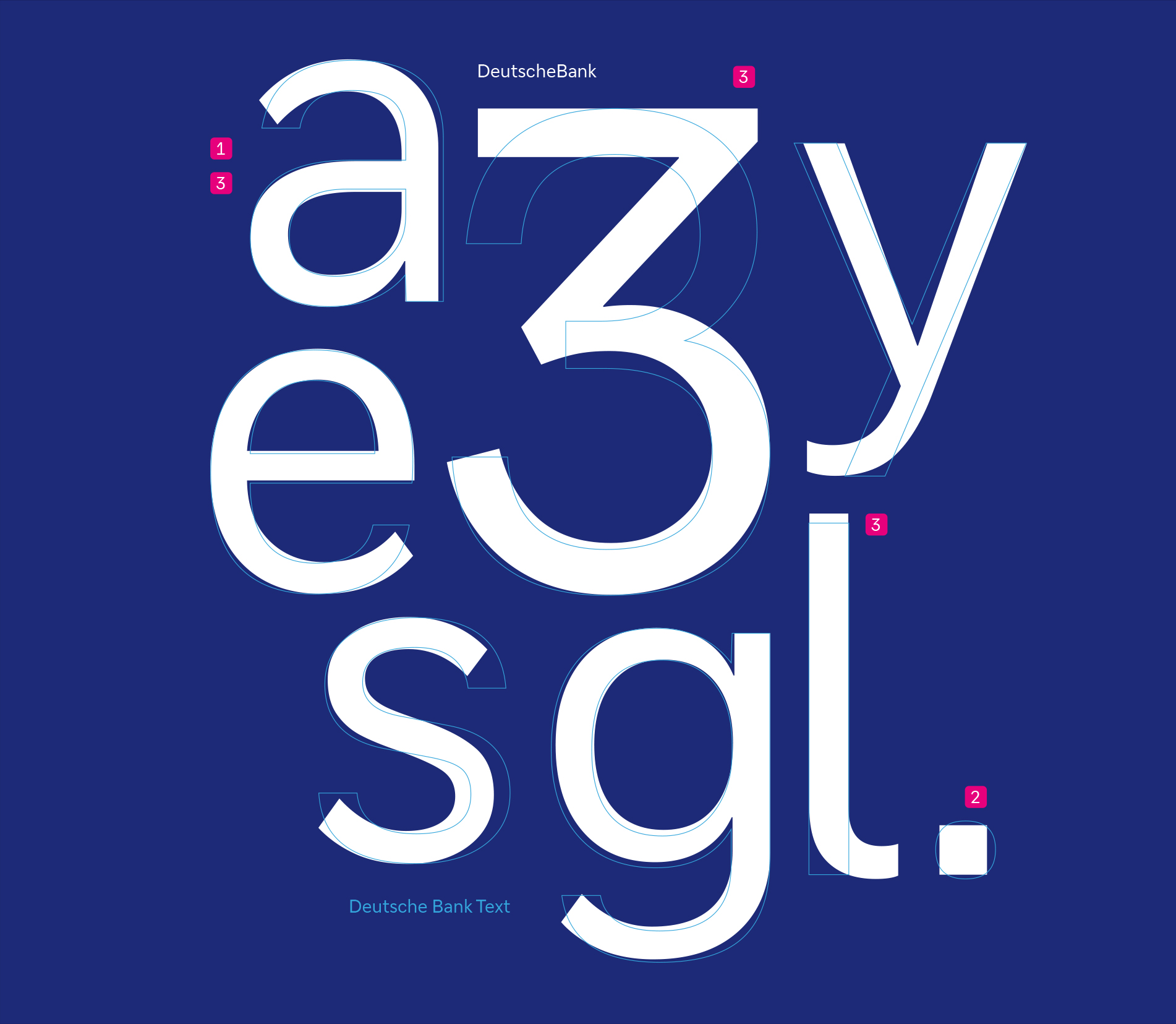
DeutscheBank differs from the old Deutsche Bank font – Deutsche Bank Text in several characteristics:
- Angled stroke ends
A special feature of the DeutscheBank font family are angled stroke ends, which Deutsche Bank Text does not have. - Square punctuation
DeutscheBank's punctuation is based on the geometric shape of the square, while Deutsche Bank Text has rounded punctuation. - Readability
Individual characters have been revised in favour of differentiation (e.g. lowercase l) and opened up for legibility (e.g. lowercase a, e, g, s, y). - Naming
The naming of the two fonts is different: The DeutscheBank font family is written together. This spelling is visible in every operating window of the font programme.
Spelling of both fonts using the example of the font menu in InDesign:
DeutscheBank — Weights
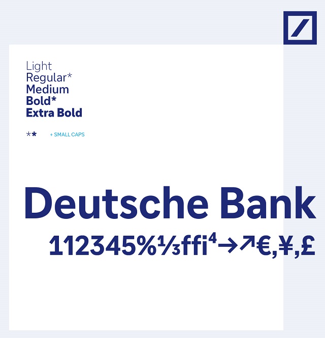
Deutsche Bank will be available in ten weights for Latin Extended, Greek and Cyrillic. It will have various functions and glyphs, such as tabular figures and fractions. By the end of June, for languages such as Arabic and Chinese, substitute fonts will be defined that offer similar character to the new Deutsche Bank.
Our Deutsche Bank font weights:
- Used in body copy:
- Light
Light Italic
Regular
Regular Italic
Medium
Medium Italic
- Light
- Used in headlines and sublines:
- Bold
- Used for emphasis:
- Bold Italic
Extra Bold
Extra Bold Italic
- Bold Italic
Application
The full version of Latin Extended with the weights Light, Regular, Medium, Bold and Extra Bold is available for DTP, Web and Office.
Download
Substitute fonts for secondary languages
Substitute fonts have been defined for other language areas. We have prioritized selecting aesthetically pleasing fonts available in a variety of weights, which will facilitate the translation of the new design into different language systems.
Please refer to the PDF document and locate the page that pertains to your country’s usage.