
Advertising – print and online
Deep impact — from awareness to activation
Across all divisions, our campaigns embody our brand attitude and express our purpose: “Dedicated to our clients’ lasting success and financial security at home and abroad.”
As it is vital to communicate our messages and products in an easy-to-understand and eye-catching way, we have created a unique look and feel with our expanding box layout system, which creates a strong association with the Deutsche Bank brand.
Our layout system offers a high degree of similarity across all touchpoints, as well as the flexibility to adapt to different media requirements.
Multiple tonalities — overview
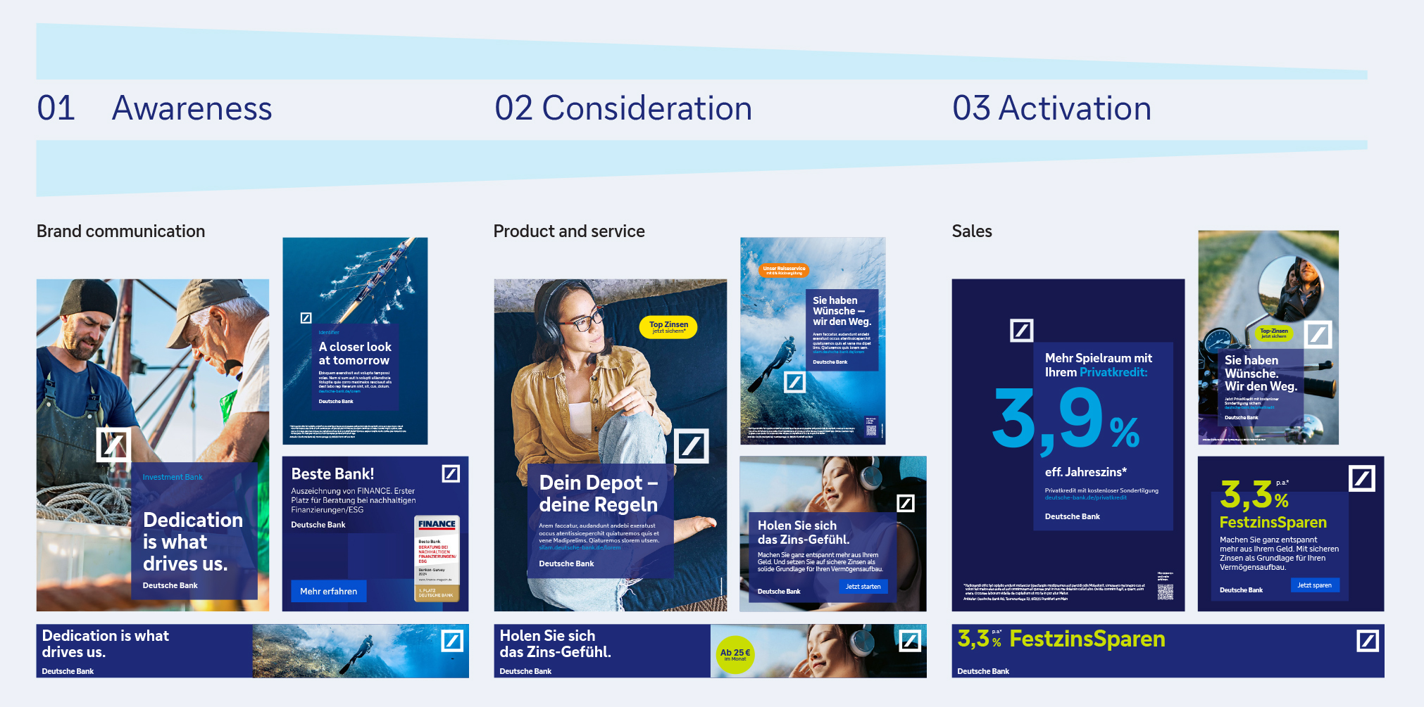
Awareness
- Big logo and part of the emotional imagery in full size
- Low contrast in typography use (consistent font sizes and styles)
- Use of the expanding box with the Deep Blue transparencies or in Deep Blue on dark blue
Consideration
- Medium to large logo
- Very emotional imagery with people at the centre, full surface motifs
- Use of typography in defined font sizes
- Use of the expanding box with the Deep Blue transparencies
- Use of activating stoppers is possible
Activation
- Logo is small and functions more as a sender
- Prominent and high-contrast typography (different font sizes and types, big numbers as labelling)
- Use of the expanding box in two variants: Deep Blue on dark blue and colour gradients in both variants
Individual components
01 Imagery

Our imagery is captured with a real-world look and feel. Nothing is posed or artificial – just real people living real moments.
See details in "Basic elements", chapter 6
02 Expanding box
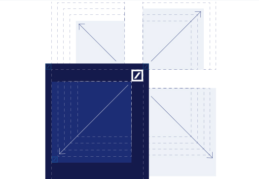
The core element is the expanding box. It creates the link between brand and message, between logo and communication. It is flexible in size and placement.
See details in "Basic elements", chapter 7
03 Transparency

Our transparent Deep Blue expanding box removes storytelling barriers for the viewer while connecting our messaging to our brand.
See details in "Basic elements", chapter 9
04 Backgrounds

The logo matrix can be used as a background for text ads and reinforces our branding in a subtle yet impactful way.
See details in "Basic elements", chapter 5
05 Message hierarchy
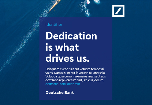
The sequence of the components in the expanding box is always the same, starting with the optional sender identifier, followed by the headline, body text, URL and Deutsche Bank identifier.
See details in "Basic elements", chapter 7
06 Stopper
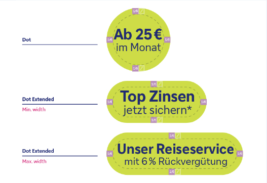
The stopper should be used with intention to communicate specific details, such as special conditions, a bonus offer or limited-time information.
See details in "Basic elements", chapter 8
Application
Use this document for guidance on creating print and online advertising, and refer to the “Basic elements” document for explanations regarding visual language, colours, Deep Blue transparency, and more
Templates
Templates are available in various sizes in InDesign. Please feel free to download any that you need. PDF files are also available for reference.