
Layout system — expanding opportunities
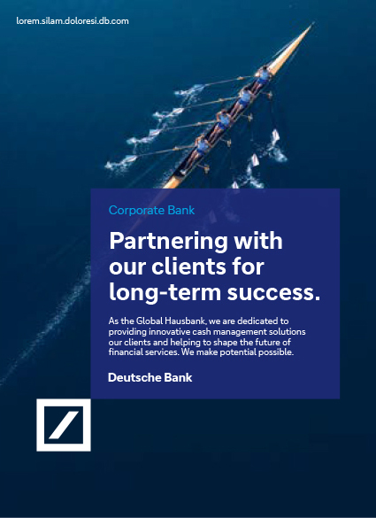
Deutsche Bank’s layout system is based on a blue area called the expanding box. Our expanding box is derived from our logo. Symbolising stability and simplicity, it is a visual representation of the diverse ways we expand our customers’ opportunities. It is used as a consistent brand element, appearing extensively across a multitude of communication channels and assets.
The expanding box creates the link between brand and message, between logo and communication. It shows that we truly stand behind everything we say.
With this design idea, the sender and the message are also spatially connected. Our logo becomes part of the message with the visibility it deserves. At the same time, it defines the aspiration we set for our headlines and messaging.
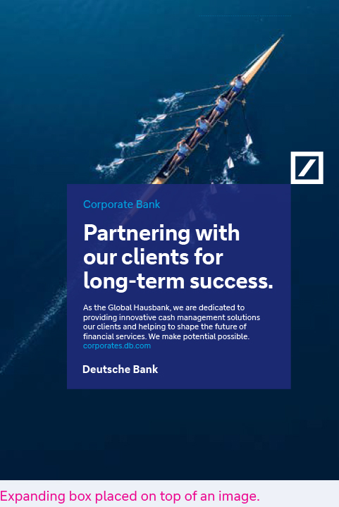

Expanding box — different variants
Appearances
There are three variants of the expanding box:
As a transparent surface placed on top of a photograph (without a gradient)
- As a surface in Deep Blue on dark blue
- As a gradient overlay placed on a contrasting gradient background with opposite directions
- The headline and copy are always left-aligned in the expanding box.
The Deutsche Bank identifier is placed in Deutsche Bank Bold at the end of the expanding box below the copy. Keep in mind that the claim is only used internally.
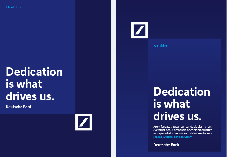

Expanding box — sizing
The size of the expanding box varies depending on the format of the medium, the image background and the amount of text.
The expanding box emerges from the logo and can be docked onto any of the logo’s four corners. It can be square or rectangular. It can go into the bleed or not.
The important thing is to always consider the size of the expanding box. It should not be too small and compete visually with the logo.
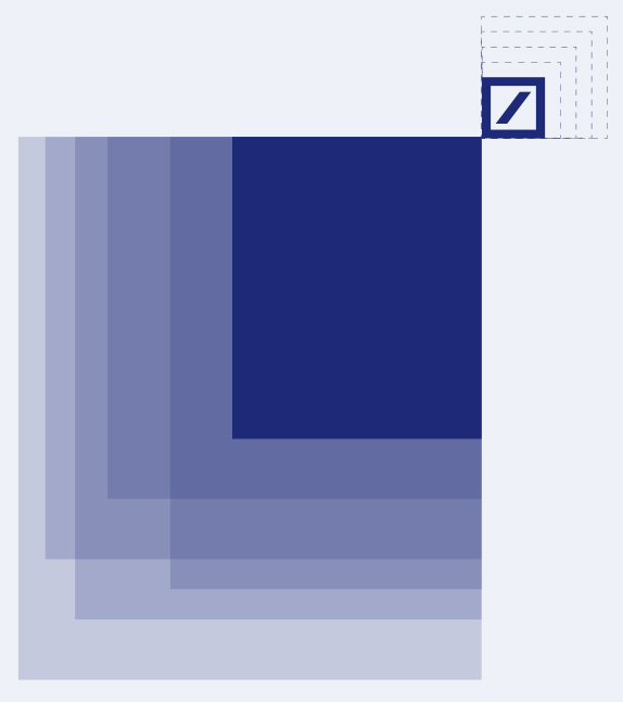

Expanding box — content
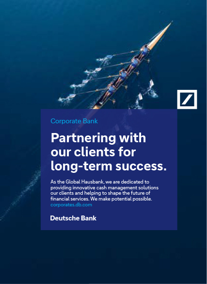
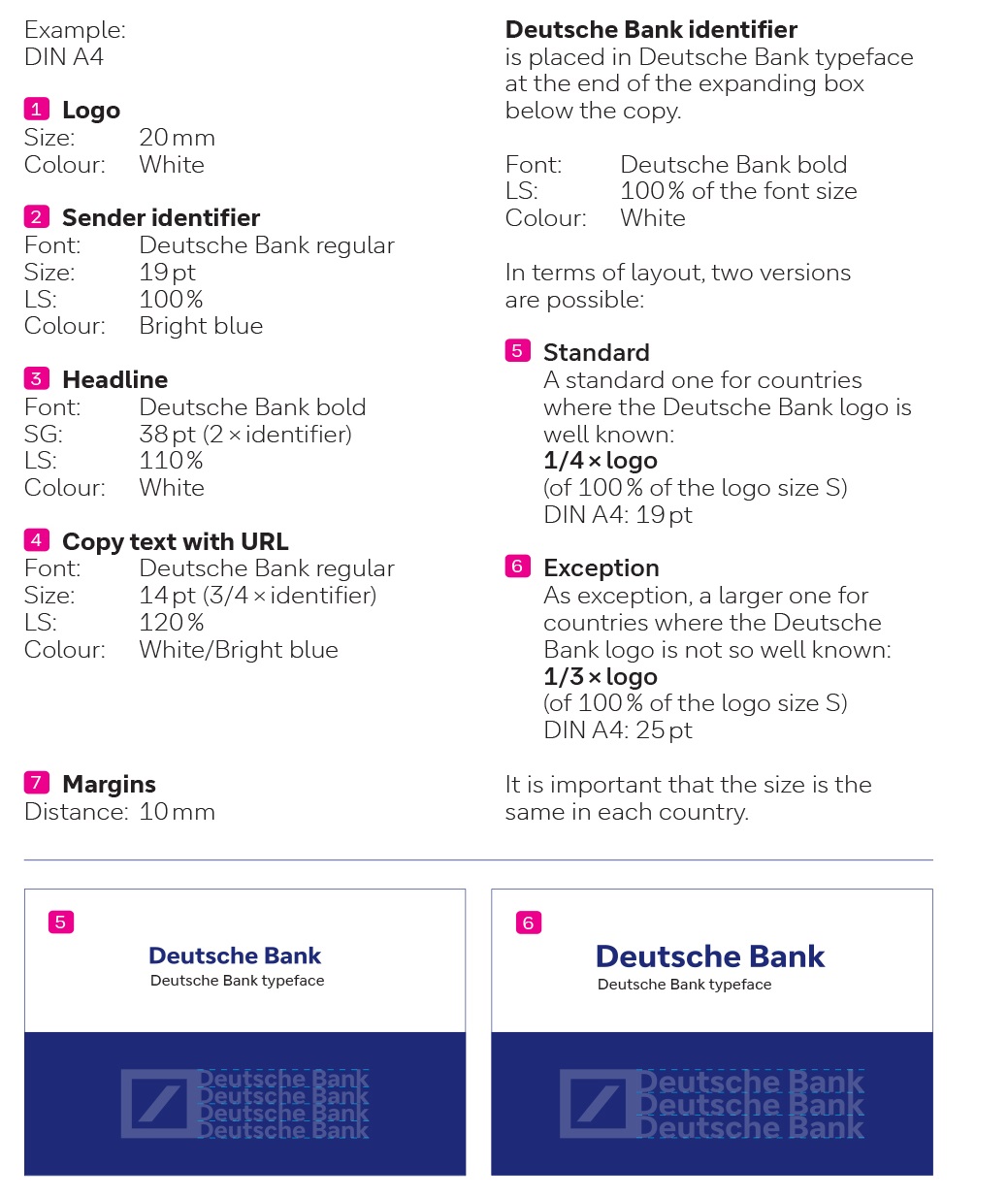
Sequence of text elements within the expanding box
(all in Deutsche Bank typeface):
- Sender identifier (if required)
- Headline
- Copy text with URL
- Deutsche Bank identifier
(as Deutsche Bank typeface in bold, not the logotype)


Layout system — flexibility
Expanding box
The expanding box has a flexible size depending on the length of the text. It can be placed flexibly in the format, wherever it suits the image best.
Logo
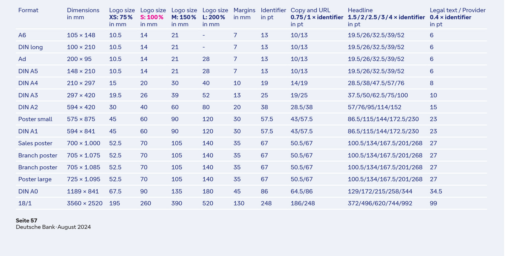
The Deutsche Bank logo can be used in four sizes within each format.
The standard size of 100 % defines the handling of the format in terms of its margins and regulates all elements of the layout.
Headline
For the headline, different type sizes are available depending on the amount of text.

URL — placement and variants of use
URL
The URL can be integrated into Deutsche Bank’s applications in two ways:
It can be appended to the body text in bright blue within the expanding box if its length does not exceed one line.
Alternatively, it can be placed in the top left-hand corner, aligned with the respective format margins. In this usage, it appears in bright blue or white, with the white variant taking priority.
 |
 |
 |
Layout system — measurements

Layout system — details
Minimal distance
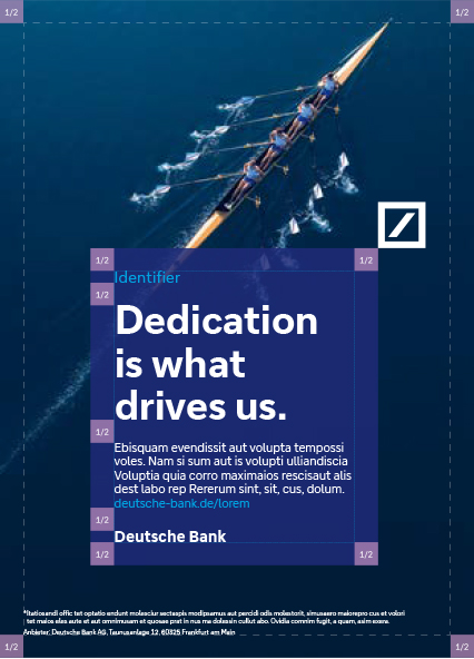
The distance between the logo, the expanding box and the bleed is 1/2 of the logo (for logo size S). The same distance is used for logo sizes XS, M and L. The distance of 1/2 logo size is also used to design the typographic elements within the expanding box. Apart from this, the logo and expanding box can be placed anywhere in the format.
Minimum and maximum sizes
The expanding box should always be at least 6 × the size of the logo (size S) used in the corresponding format.
On images, the expanding box must not be larger than 1/3 of the format.
However, as a gradient on Deep Blue without an image, it can be used significantly larger when the minimum distance to the bleed is followed.
Expanding box — examples
Multiple possibilities for impact Always following the principles of the Deutsche Bank layout system, the expanding box offers a wide range of design options across all touchpoints.
This includes, for example:
- Design flexibility for specific executions.
- Communicative and emotional display of content, focussing on an image motif or on messaging without an image.
- Highlighting numbers, figures, or offers.

Different tonalities — overview
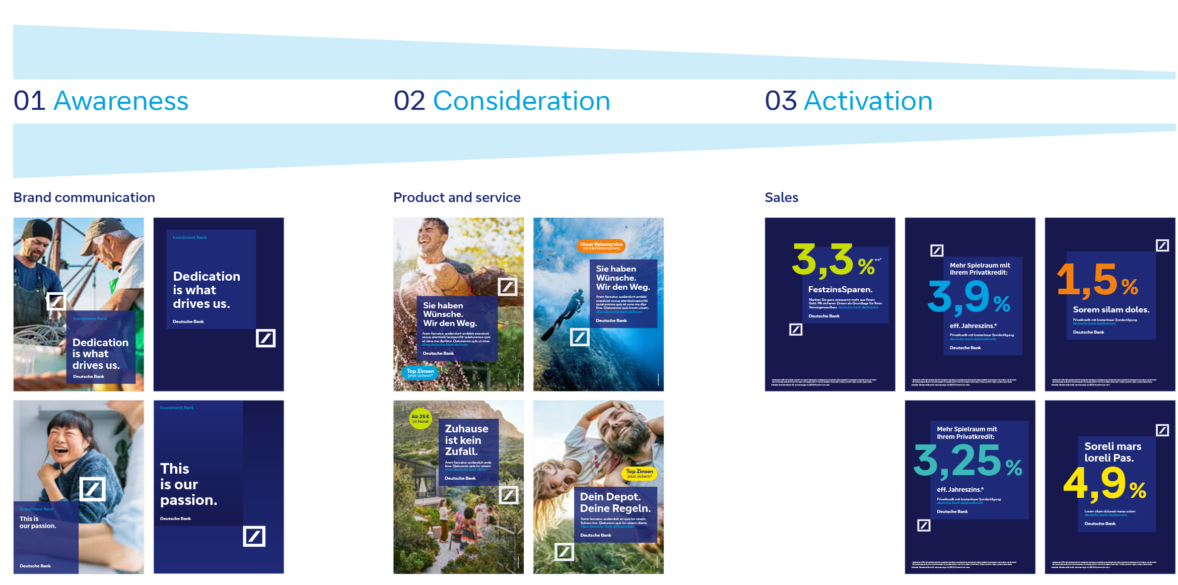
01 Awareness
- Big logo and part of the emotional imagery in full size
- Low contrast in typography use (consistent font sizes and styles)
- Use of the expanding box with transparency of 85 % or in Deep Blue on dark blue
02 Consideration
- Big logo and part of the emotional imagery in full size
- Low contrast in typography use (consistent font sizes and styles)
- Use of the expanding box with transparency of 85 % or in Deep Blue on dark blue
03 Activation
- Logo is small and functions more as a sender
- Prominent and high-contrast typography
- (different font sizes and types, big numbers as labelling)
- Use of the expanding box in two variants:
- Deep Blue on dark blue and colour gradients in both variants